ShopDreamUp AI ArtDreamUp
Deviation Actions
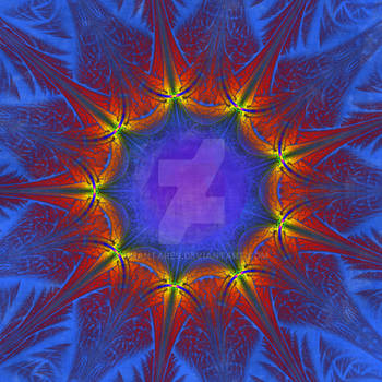


Suggested Deviants


Suggested Collections


You Might Like…


Description
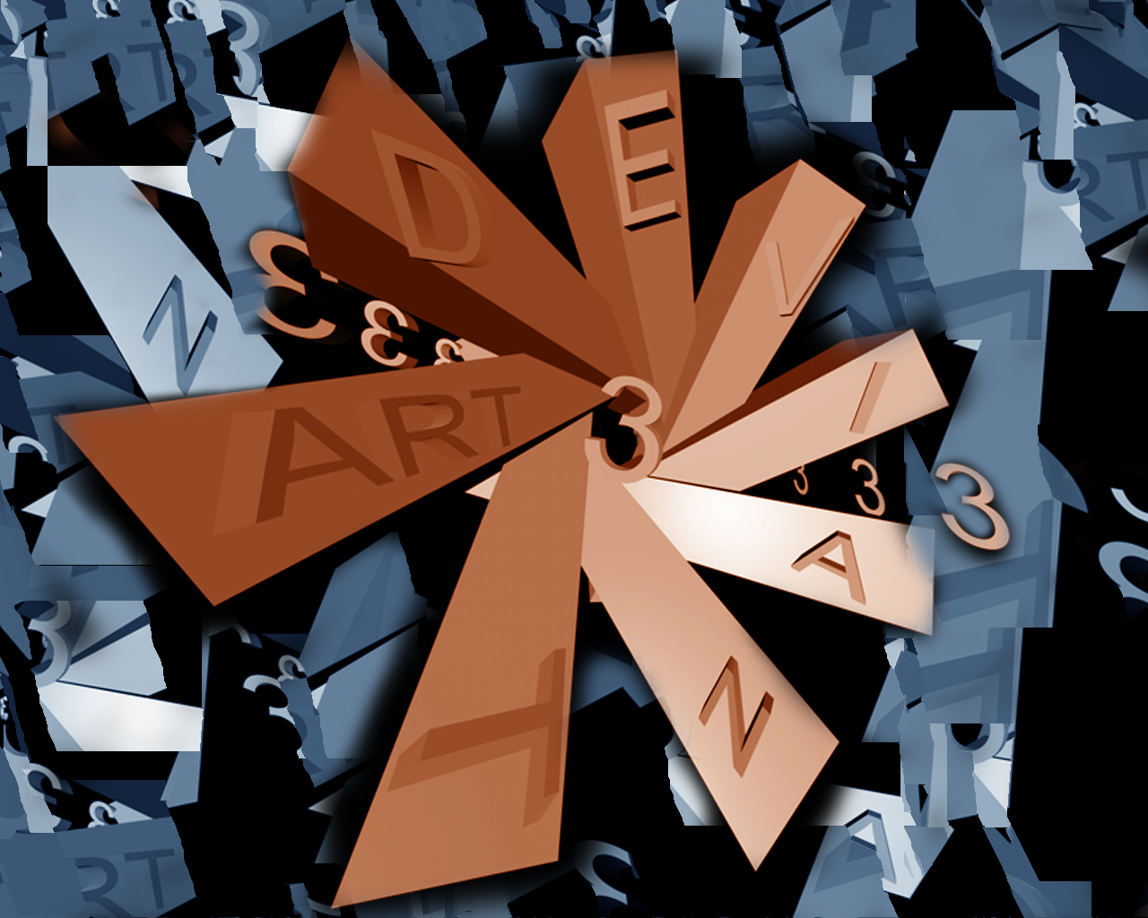
( Wallpaper : Abstract )
Looking to do a blend of Cinema 4d and Photoshop with this. I wanted something abstract but not too abstract. Let me know what you think : ) I am just a beginner as far as 3d goes, but trying to get better all the time.
Looking to do a blend of Cinema 4d and Photoshop with this. I wanted something abstract but not too abstract. Let me know what you think : ) I am just a beginner as far as 3d goes, but trying to get better all the time.
Image size
1280x1024px 657.71 KB
© 2003 - 2024 sushifreak
Comments8
Join the community to add your comment. Already a deviant? Log In
I like the contrasting colors. I also like the fact that the background is chaotic but the design in the center has shape and organization.